The World Cup often showcases a fascinating convergence of style and sport. While the outcomes of the matches are pivotal, the visual flair of the kits contributes heavily to the tournament’s character. This article reviews all 48 away kits featured this year, traditionally a realm where designers are more experimental.
Swiss Kits: The Swiss away shirt draws inspiration from the nation’s passports, featuring a peculiar color more suited for visibility on pedestrian crossings than a football pitch.
Haiti’s Unique Approach: Saeta, a lesser-known kit provider, offers Haiti’s away kit. While experimenting with design, the use of palm trees adds a unique touch, though the overall appeal remains limited.
Norway’s Dark Theme: Norway’s kit presents an all-black ensemble, a testament to Viking spirit intended to intimidate. Yet, it lacks variety across the ensemble.
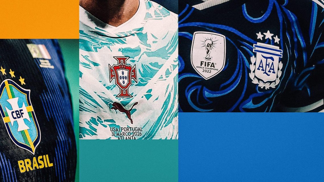
Portugal’s Nostalgic Design: Though claimed to honor iconic players, Portugal’s away shirt features an unclear connection to its football legends. Its partial swirling ocean design is eye-catching but puzzling.
Qatar’s Simple Style: Qatar’s kit is remarkably understated. A simple white shirt with maroon stripes suggests a lack of preparation, yet maintains a clean look.
Canada’s Dusty Inspiration: Canada’s away shirt, resembling a dusty aftermath of home renovations, finds less favor for its resemblance to unintended patterns.
Croatia’s Tranquil Tones: Croatia’s blue-themed kit is better received than its home counterpart, as it avoids altering the traditional checkered design.
Low-Key Scotland: The away kit takes inspiration from Scotland’s aesthetic but fails to make a lasting impression, missing vibrancy and imagination.
Florals and Purple Challenges: The bold floral motifs on a purple shirt aim for a niche audience, though it falls short of mainstream appeal.
Bolder Cape Verde: Featuring a design that contrasts well, Cape Verde’s shirt stands out more than the home version due to its color scheme.
Elegant American Theme: Inspired by the American flag, this shirt incorporates stars and stripes in a manner that remains unmistakably patriotic.
Accra’s Influence on Ghana: Ghana’s bold shirt draws from local markets, easily standing out as one of the tournament’s most vibrant designs.
Brazil’s Unique Identity: Brazil’s shirt showcases a Rorschach-like pattern influenced by the poison dart frog, enhanced with the distinctive Jordan brand logo.
Cape Verde’s Simplicity: While similar to their home shirt, the white away version lacks clarity in its design.
Czech Republic’s Crystal Inspiration: With a crystal-themed design, this shirt remains quite forgettable despite an experimental motif.
New Zealand’s Wind Symbolism: Puma’s use of hau, or breath of life, offers swirly patterns that cater to the thematic elements of New Zealand’s kit.
Iran’s Cheetah Theme: This design appears plainer yet functional, featuring Asiatic cheetah motifs visible but not overwhelming.
Returning to Tradition in Mexico: Mexico’s shirt reflects past successful designs with an eye to modern color contrasts.
Artistic Inspirations from Argentina: The new artistic patterns echo local art forms, though the clarity of these remains debatable.
Jordan’s Chivalry in Simplicity: The colors and style reflect the national theme of Chivalry, playing effectively into cultural identity.
Algeria’s Landscapes: While the background pattern is hard to discern, it serves as a tribute to the country’s diverse geography.
Simplicity in Saudi Arabia: Featuring a straightforward design with color contrast, the kit brings elegance within simplicity.
Austrian Coffee Culture: Inspired by Viennese coffee houses, this kit represents an original attempt to embed local culture into the design.
Cameroon’s Kaleidoscope: Unique yet somewhat like a West African rival, Senegal’s shirt features bold patterns that perhaps defy traditional logic.
Reebok Resonance in Panama: Panama’s design revives nostalgic memories of past team aesthetics, particularly those led by Reebok.
Sweden’s Classic Approach: Adhering to a classic color swap, Sweden balances modern design influence with traditional aesthetics.
Turkey’s Traditional Band: Turkish kit maintains its iconic chest band while creatively referencing the country’s identity through its design.
Scotland’s Retro Reference: Evoking nostalgia, Scotland’s away kit references styles from past eras, embracing timeless design elements.
Pastel Challenges in France: Against norms, France’s shirt successfully employs pastel shades with contrasting trim, creating an impressive look.
Tunisia’s Eagle Imagery: Accentuating Carthage’s eagle on a striking red base, this kit prominently displays cultural emblems.
Spanish Literary Themes: Symbolic graphics acknowledge the Spanish language’s heritage, blending subtly with the overall aesthetic.
Belgium’s Artistic Heritage: Inspired by surrealism, Belgium’s design balances intricate details with overall visual appeal.
Japan’s Pattern Success: Japan incorporates creative yet traditional motifs, producing a shirt that combines subtlety with design flair.
Curacao’s Limited Edition: Despite Curacao’s limited World Cup opportunity, its vibrant kit stands out as sold-out success due to popular demand.
 World Cup Analysis and Power Rankings
  World Cup Highlights and Key Matches
  Colombia Secures World Cup Round of 32 Spot with Victory Over DR Congo
  White Sox Edge Out Guardians; Claim First Place in AL Central
  Philadelphia Phillies’ Stunning Comeback Victory Against Washington Nationals
  Folarin Balogun’s Impact and Future Moves Amid World Cup Success